01
The challenge
Most care agency websites read like insurance paperwork, and Ameriwell were about to commission another one.
02
What we did
A brand and a site built from one line the client said out loud in the first meeting.
01
The challenge
Most care agency websites read like insurance paperwork, and Ameriwell were about to commission another one.
02
What we did
A brand and a site built from one line the client said out loud in the first meeting.
01
Most care agency websites read like insurance paperwork. Stock photography of smiling nurses, a bulleted list of services, a contact form nobody wants to fill in. The category had trained families to expect something clinical at exactly the moment they were least able to tolerate it.
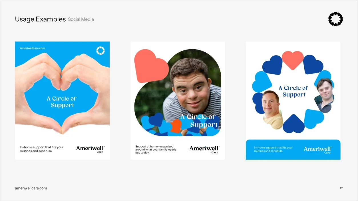
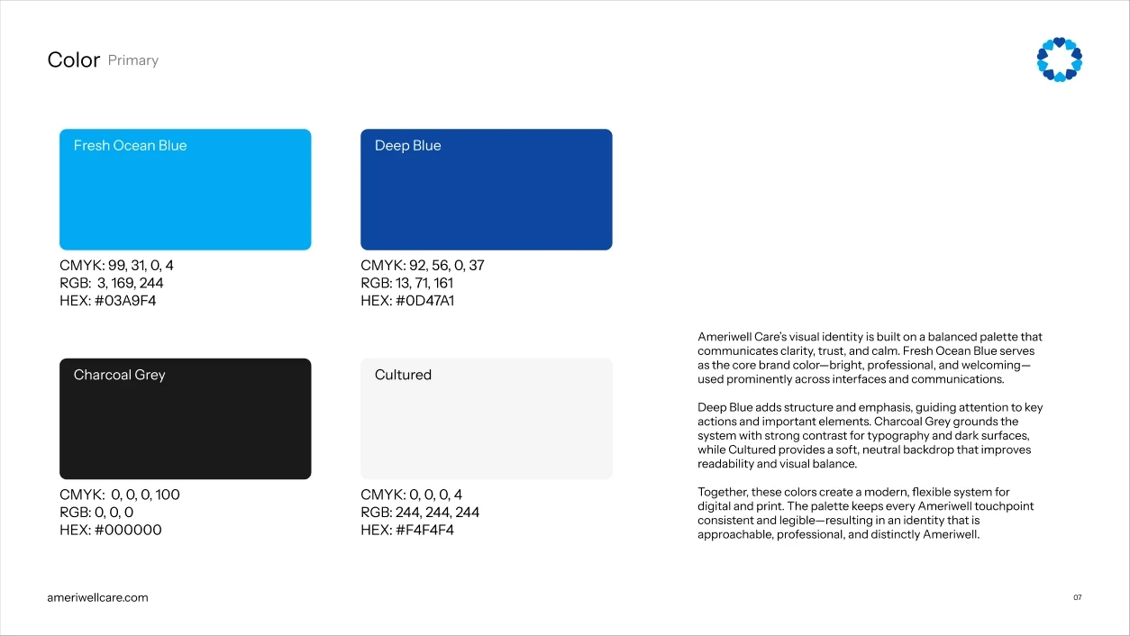
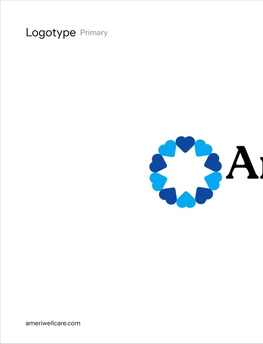
The concept came out of the client's own words in the first meeting: a circle of support, because a circle goes on forever. We built the identity around that line rather than around a service list, and the mark itself became a ring of overlapping figures.
02
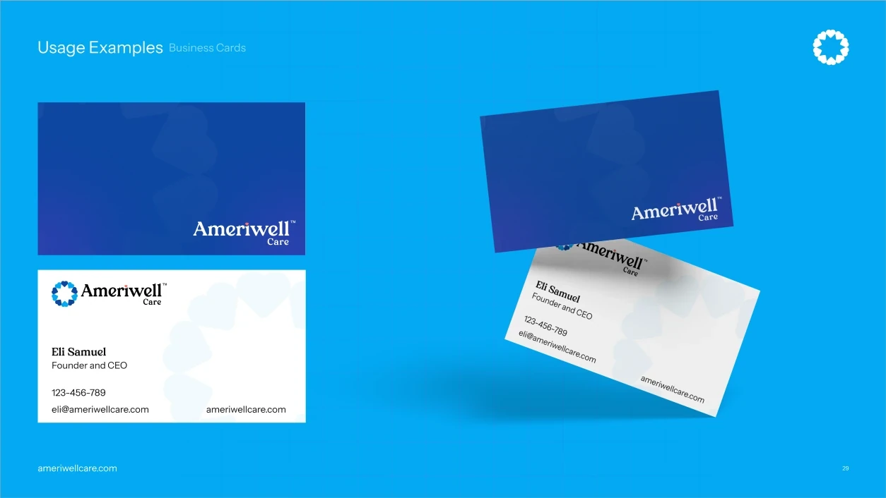
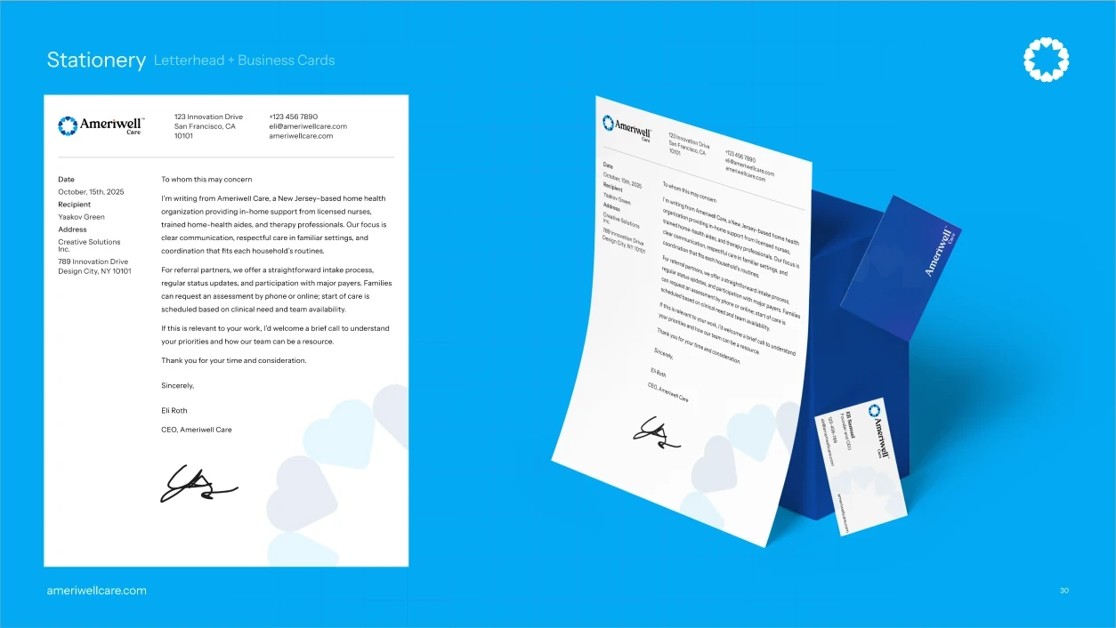
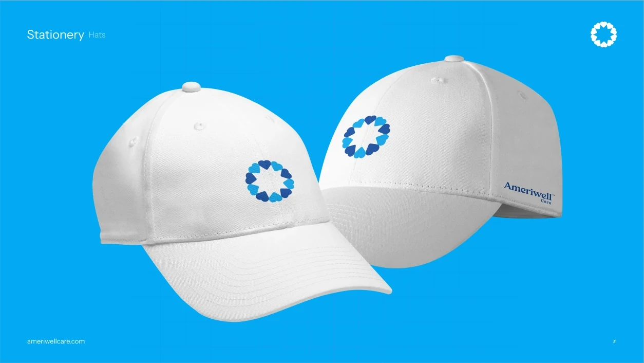
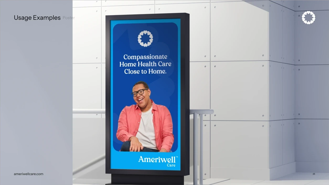
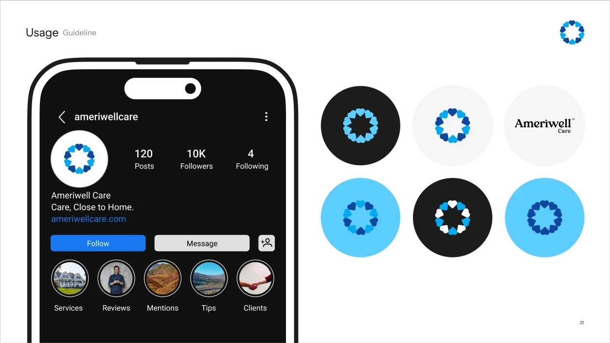
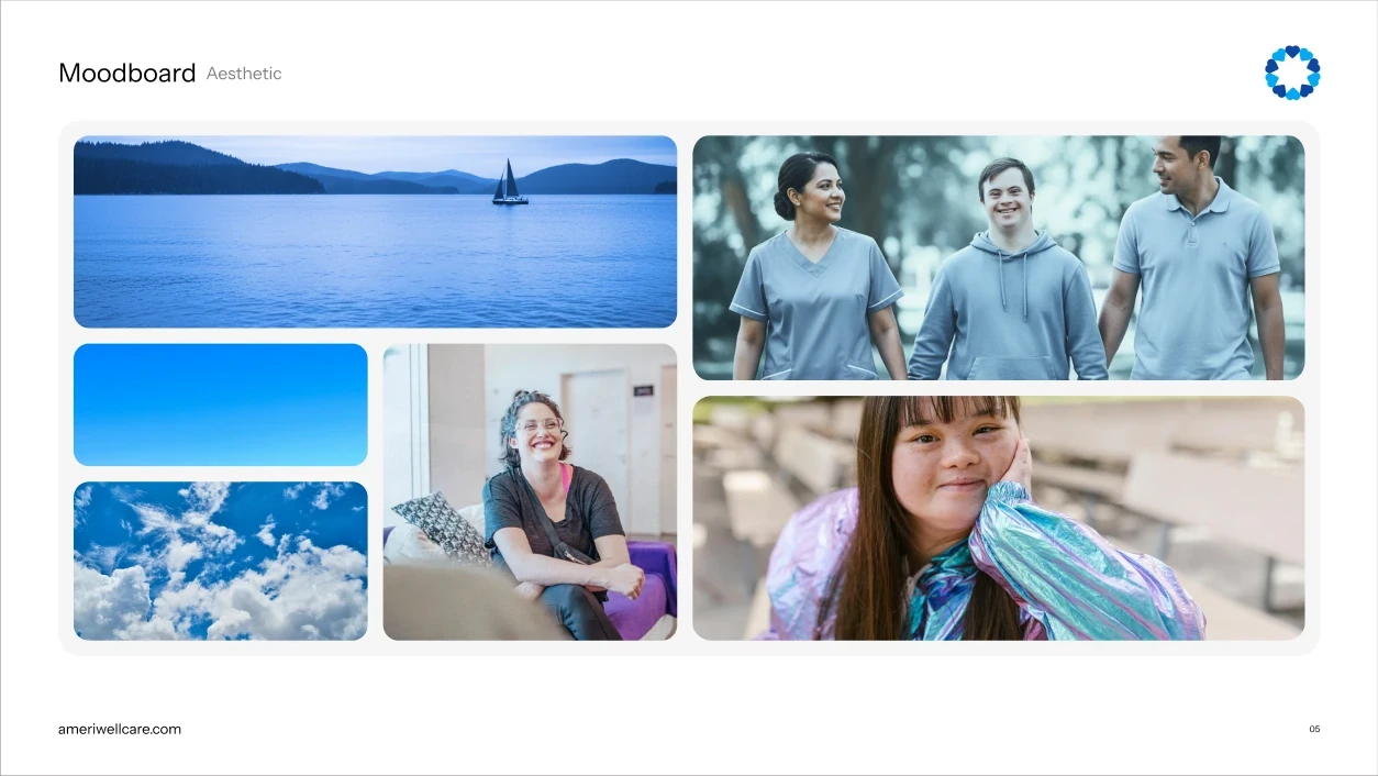
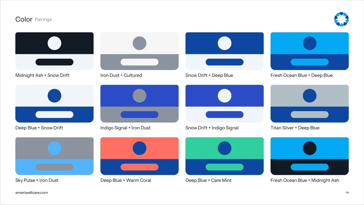
Ameriwell needed a system, not a logo. The same mark has to hold on a caregiver's ID badge, a state compliance form, a bus shelter and an Instagram story — often reproduced by someone who has never seen the guidelines.
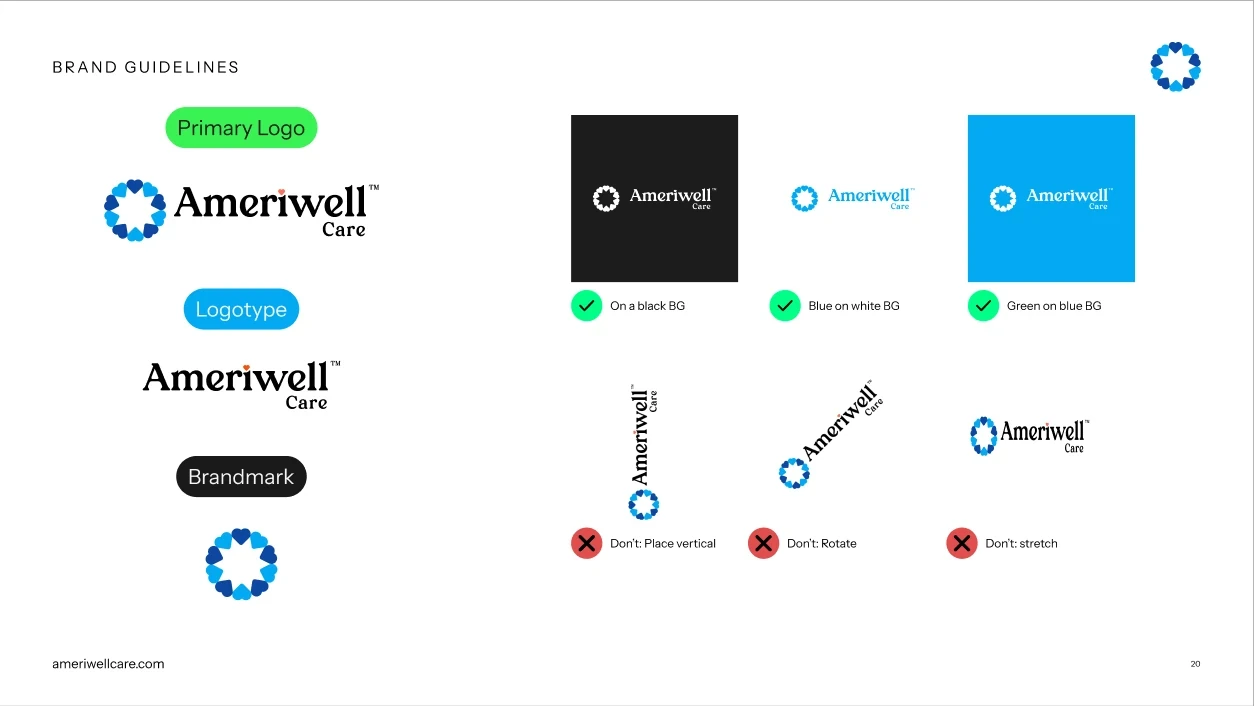
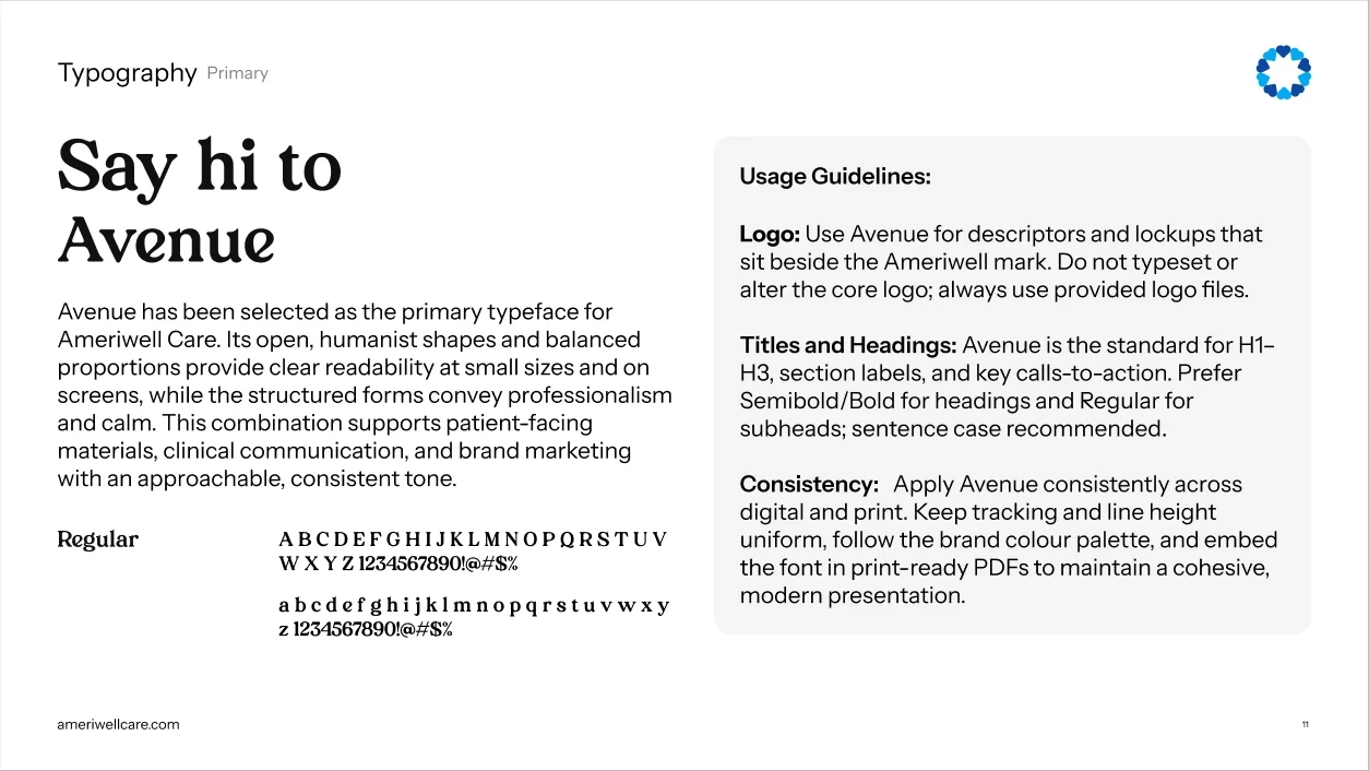
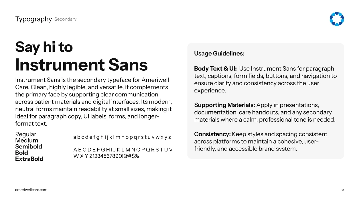
So the identity ships as a full book: primary logo, logotype and brandmark, with the failure cases drawn out explicitly. Avenue carries the headlines, Instrument Sans does the working copy.
03
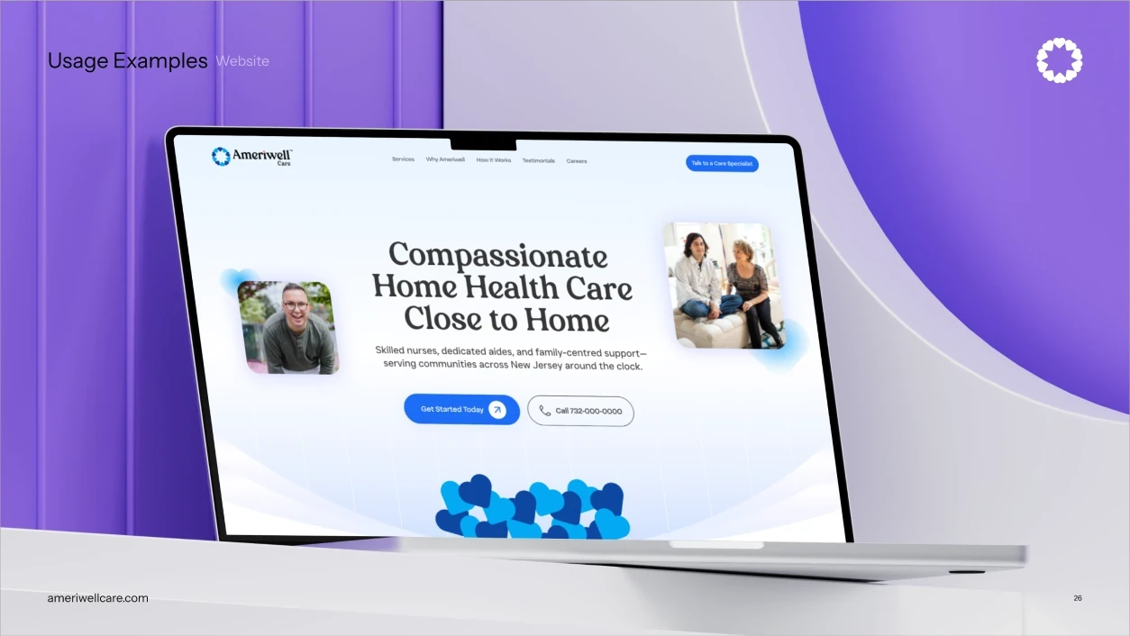
Families hiring a caregiver and people becoming one matter equally to this business. Most agencies bury recruitment behind a careers link; here the two audiences share the hero, side by side.
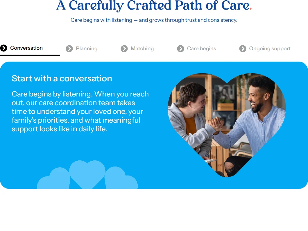
The rest of the homepage follows the same logic. One editorial headline, a full-bleed moment between two real people rather than a lobby photograph, and the care process drawn as a path that opens with a real conversation — because that is genuinely how they work. There is not a single exclamation mark on the page.
04
Every service page needed to show what the support actually looks like — helping someone cook, getting the vacuuming done, sitting down for a conversation. Photographing that honestly is close to impossible: it is people's homes, and it is private.
So the services run on a set of looping vector animations drawn in the brand's own two blues. They show the work without asking anyone to perform it for a camera, and because they are drawn rather than shot, the system extends to a new service whenever one is added.
05
The system was handed over as artwork and rules together, so the client's own team could keep applying it without coming back to us for every asset.